 Add Row
  Add
Add 


A spa website color scheme that truly calms and converts uses soft, natural tones—like muted greens, warm neutrals, gentle blues, and earthy accents—to help visitors feel relaxed and safe while guiding them toward booking. These colors reduce visual stress, build trust, and quietly reinforce the feeling of care your spa offers in person. When your website feels soothing instead of overwhelming, visitors stay longer, feel more confident, and are more likely to take the next step.
How can the perfect spa website color scheme enchant visitors while boosting conversions? Discover the calming hues that create a soothing experience and transform clicks into loyal customers, making your spa’s online presence both beautiful and profitable.
Whether you manage a bustling city spa or a boutique wellness brand, the right colors will shape your guests’ first impression—and set the stage for trust, comfort, and bookings.
If website design feels overwhelming, you’re in the right place: this guide simplifies color palettes into actionable, guest-centered steps you can use with confidence.
Why Spa Website Color Schemes Matter: Calming Guests, Building Trust, and Driving Bookings
Opening Hook: How the Right Spa Website Color Schemes Influence Conversions
Imagine a first-time guest landing on your spa website. In just a few seconds, before reading a word of your copy, they’ve already absorbed the mood, trustworthiness, and professionalism of your business—thanks to your color palette.
Choosing the right spa website color schemes isn’t just about aesthetics; it’s a strategic decision that deeply affects guest trust, brand identity, and bookings.
Color psychology research repeatedly shows that palettes for wellness brands shape perceptions and decisions. Soft blues, earthy tones, and neutral colors don’t just look beautiful—they create a sense of calm, signalling to visitors, “You’re in the right place to relax.”
This is especially important for busy, overwhelmed spa owners who need their website to work as hard for them as their team does in person.

What You'll Learn About Spa Website Color Schemes
The connection between spa color palette choices and guest trust
10 proven spa website color schemes that support relaxation and bookings
How to choose a color palette for your wellness brand without overwhelm
Common spa color scheme mistakes to avoid
Sample swatches and palettes for wellness brands to inspire your next refresh
How Spa Website Color Schemes Fit Into a High-Converting Spa Website
The Role of Color in Spa Website Design and Brand Identity
Color, more than almost any design element, sets the emotional tone of your website. For a wellness brand, a harmonious blend of relaxing spa hues signals that your digital presence matches the care and quality of your in-person experience.
When your color palette is chosen mindfully—it aligns with your physical spa decor, your guest expectations, and even the personality of your business—it instantly strengthens your brand identity.
This creates a seamless story, assuring visitors that your spa values comfort and professionalism. In the context of website design, calming color schemes do more than please the eye.
They guide focus and reduce digital “noise,” minimizing stress and making it easier for guests to move from interest to booking.
A thoughtful palette for your spa can boost bookings because guests feel welcomed, at-ease, and confident from the first click.
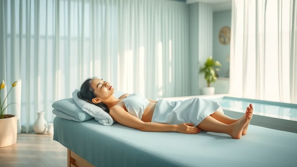
Color Schemes and Guest First Impressions in the Wellness Industry
The wellness industry is built on trust and comfort. Guests arriving at your spa, whether in person or online, seek a sense of calm and belonging.
If the color scheme of your spa website clashes with those expectations—think harsh reds or overly bold neons—you risk losing credibility before you can even say “welcome.”
Relaxing blues, gentle greens, and soft beiges are common choices for spa color palettes because they evoke feelings of renewal and tranquility. First impressions truly matter: a visually cohesive spa color palette communicates attention to detail and reassures even first-time visitors that your business understands their needs.
The moment a guest senses a harmonious color environment, their journey toward booking feels easier—and more natural.
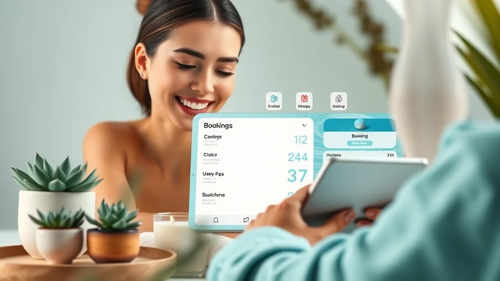
How Spa Color Palettes Guide Booking Paths and Trust
Every color on your website serves a purpose, whether it’s a soothing background or a bolder action button. Calming colors guide visitors, subtly highlighting where to browse, how to find services, and where to book without ever feeling “pushy.”
This balance is essential for wellness brands: you want a palette for your spa that lowers anxiety, keeps guests exploring, and leads them to book.
Strategic color palettes for wellness brands can highlight conversion points—like “Book Now” or special offers—without breaking the relaxing mood. The result? More guests feel ready to commit, and your conversion rates reflect it.
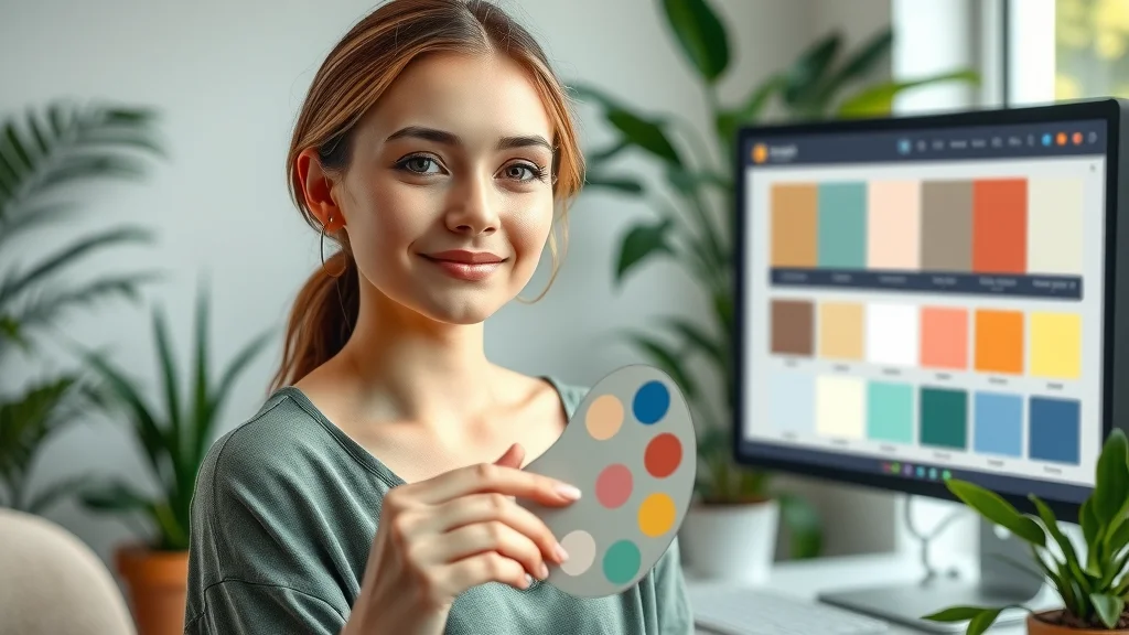
Quick Primer: What Is a Spa Website Color Palette?
Understanding Spa Color, Scheme, and Palette — With Real-World Spa Examples
Let’s keep it simple: a color palette is just the set of colors you choose for your website. Think of it like the signature scents, music playlist, or interior decor you select for your physical spa.
Your spa website color scheme is a mix of main hues (backgrounds, buttons), accents (call-to-actions), and neutrals (whites, greys).
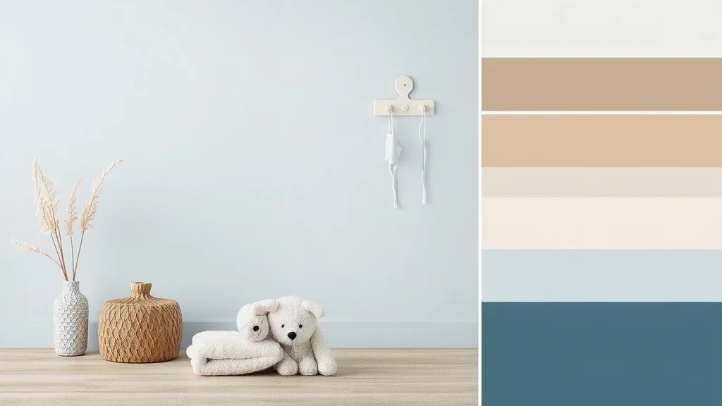
When you see a calming blue spa page, a neutral earth-tone booking form, or a gentle pop of pale pink in a wellness brand’s header, that’s the color palette at work. Real spas—like Urban Retreat or Coastal Calm Sanctuary—use soft blues and gentle sage green to instantly communicate their values and make guests feel at home.
Your palette should work the same way: choosing colors that evoke feelings of calm and trust, not overwhelm or confusion.
"Think of your color palette like your spa’s signature scent or music playlist — it sets the mood for the entire guest experience, both online and in person."
How to Choose Spa Website Color Schemes That Actually Support Wellness Brands
Step 1: Consider Your Wellness Brand Identity and Spa Goals
Before diving into specific colors, step back and clarify what your brand stands for and who you serve.
Are you a high-end urban spa with sleek interiors, or a rustic wellness brand focused on nature? Your answers guide your palette for your spa.
Is your goal to attract stressed office workers looking for calm, or adventure-seekers pursuing holistic wellness?
Select colors that truly reflect your mission and make your ideal guests feel welcomed—soft blues for tranquility, earthy greens for connection to nature, or a touch of warmth like pale pink for comfort.
Always remember: your color scheme should reinforce your spa’s unique story, not follow fleeting trends.
Step 2: Common Color Palette Mistakes for Relaxing Spa Websites
It’s surprisingly easy to overwhelm a spa website with too many color choices. Common mistakes include using harsh, trendy colors that don’t match your physical spa or copying another brand’s palette for a quick fix.
Overusing bold accent colors, poorly matching background and text for readability, or ignoring accessibility standards can all lead to fewer bookings.
For a relaxing spa website, less is more—a harmonious blend of 3–5 core colors (plus a few neutral accents) is often your safest, most effective choice.
By circulating colors found in your spa’s interior design, towels, and natural elements, you create a visually cohesive guest experience in person and online.

Step 3: Choosing Calming vs. Energizing Color Palettes for Wellness
Colors can either set a soothing atmosphere or spark energy—sometimes both, depending on your service menu. For most spas, calming spa color palettes using soft blues, sage greens, and gentle neutrals create a sense of calm and trust.
If your wellness brand includes invigorating treatments like fitness or hydrotherapy, you might layer in subtle energizing hues (think clear teal or a pop of coral) to keep things fresh without overwhelming.
Test your palette for your spa by mixing calming background colors with brighter accent buttons for calls-to-action, creating a cohesive pathway from relaxation to booking. Always ask yourself: “Would these colors feel at home in my spa lounge, not just on my site?”
Checklist: Factors to Consider Before Picking a Spa Color Palette
Brand purpose and feeling
Guest demographics and expectations
Alignment with physical spa design
Accessibility and readability online
Trust, booking, and conversion goals
10 Spa Website Color Schemes for Relaxing, High-Converting Wellness Brands
Name |
Description |
Ideal For |
Color Swatches |
|---|---|---|---|
Serene Oasis |
Soft blues, seafoam greens, and cloud whites instill instant calm. |
Luxury day spas, urban wellness studios |
 |
Botanical Sanctuary |
Earthy greens, beige stones, and wood accents promote natural wellness. |
Holistic and eco spas |
 |
Pale Pink Retreat |
Pale pinks paired with soft beige and gentle sage evoke comfort and care. |
Women’s spas, beauty-focused brands |
 |
Naturals & Neutrals |
Warm taupe, creamy white, touches of sand for trusted simplicity. |
Multi-location spas, traditional wellness brands |
 |
Sage & Stone |
Classic sage green paired with stone grey and crisp off-white refreshes instantly. |
Medi-spas, modern holistic brands |
 |
Tranquil Teal |
Deep teal, pale aqua, and soft white evoke the clarity of water and fresh starts. |
Hydrotherapy spas, day spas by the sea |
 |
Coastal Calm |
Washes of blue-grey, sandy beige, with driftwood accents for coastal serenity. |
Beach spas, coastal wellness retreats |
 |
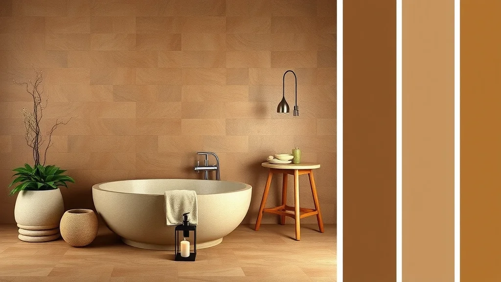
Luxury Earth |
Rich clay, dark olive, and creamy stone for grounded sophistication. |
Luxury and destination spas |
 |
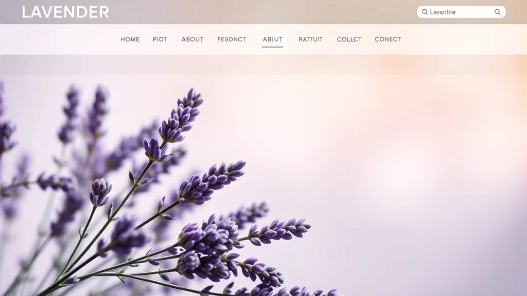
Lavender Dreams |
Soft lavender, dove grey, and warm white for gentle tranquility. |
Massage studios, sleep-focused brands |
 |
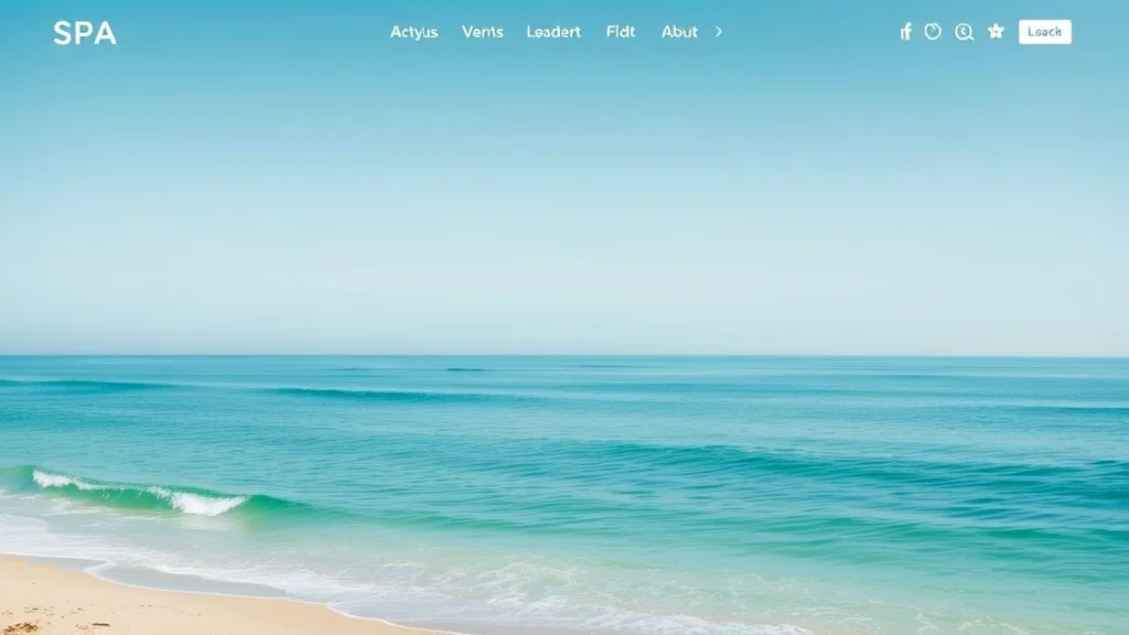
Oceanic Calm |
Vibrant aqua, deep blue, and muted sand for an immersive water-inspired feel. |
High-end spas, wellness centers with aquatic themes |
 |
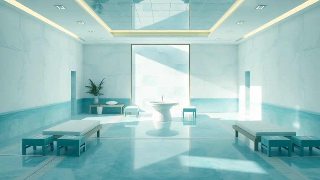
1. Serene Oasis Spa Color Palette
Why It Works for Calming, Trust-Building Spa Websites
The Serene Oasis palette uses soft blues, seafoam greens, and cloud whites to evoke a powerful sense of calm. For spa color schemes aiming to reduce guest anxiety and build immediate trust, this combination is unbeatable.
Soft blues evoke feelings of trust and health, while greens signal rest and renewal—two attributes at the heart of any successful spa experience. The cloud whites lift and brighten the site, making navigation a breeze and keeping the mood light.
This type of relaxing spa color palette is especially effective for day spas and wellness brands positioned as urban retreats, where visitors seek a break from city stress in an environment that visually whispers “breathe easy.”
Real Spa Example: Urban Retreat Spa
Urban Retreat Spa in Chicago transformed its website by trading a generic tan background for layered soft blues and pale seafoam.
Across their booking pages, gentle gradients and blues-and-greens accents mirror their plush towels and water features, giving guests a seamless, immersive spa experience from the site to the treatment bed.
In just months, the spa saw online bookings jump as visitors responded to the sense of calm and trust conveyed by the palette for their spa—proof that strategic colors aren’t just “nice to have” but a core part of digital wellness branding.
6. Tranquil Teal: Relaxing Spa Website Color Scheme
Science Behind Teal for Relaxation
Teal is a unique, refreshing blend of blue and green—colors long associated with tranquility and rejuvenation. Color psychology studies show teal lowers heart rate and creates a serene online environment, which is why it’s appearing in more high-end spa color palettes.
In web design, using teal as a core brand identity hue, especially when paired with softer aquas or off-whites, can provide a lively yet calming vibe.
For wellness brands with active offerings—such as hydrotherapy, aquatic yoga, or vitality treatments—Tranquil Teal promises balance: not too sleepy, not too bright, but a supporting color scheme that gently calls guests to action (like booking or learning more).
Best Practices for Using Teal in Color Palettes
If you choose teal as your spa color palette anchor, use it for main website elements—headers, booking buttons, or accent banners—while keeping backgrounds light and uncluttered.
The best spa websites limit teal’s intensity with soft neutrals, like pale aquas, warm whites, and subtle wood details. Always test on mobile to ensure teal remains inviting and readable, since some teal hex codes can skew dark or cold on screens.
Touches of greenery and organic props in photography help unify the digital color scheme with your real-world spa experience, so visitors feel a seamless transition from web to welcome mat.

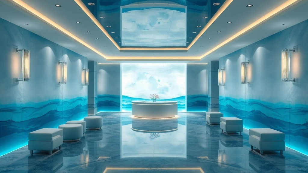
10. Oceanic Calm Spa Color Palette
Harnessing Water-Inspired Blues
The Oceanic Calm palette features vibrant aquas, deep marine blues, and touches of muted sand—transporting visitors to a restful, refreshing seaside escape.
Water-inspired colors are proven to evoke feelings of relaxation, clarity, and spaciousness, making them ideal for wellness brands and spas seeking to differentiate with a coastal, aquatic brand identity.
When guests see ocean blues blended with gentle sand tones on your site, their first impression will be one of expert curation and relaxation. This palette is particularly impactful for spas with pools or aquatic programs and those looking to create an immersive online-to-onsite experience.
Complementary Accent Colors for Spa Websites
To keep Oceanic Calm balanced (not too cold or clinical), layer in gentle accent colors like warm beige, driftwood, or subtle coral for calls-to-action.
These touches help highlight booking sections and promote special offers without breaking the calming, aquatic vibe. As with all spa color schemes, make sure your hex codes render beautifully across browsers; even a slight blue-green shift can alter the guest's perception.
If color selection or implementation feels overwhelming, remember: the best palettes for wellness brands are those that harmonize with your real-world decor and feel easy to sustain through season and trend changes alike.
How to Implement a Spa Website Color Scheme Without the Tech Headache
Working With Your Web Designer or Team
Your spa color palette shouldn’t just exist in theory—it needs to be carried through by your web designer or development team.
Start by sharing physical samples, photos of your spa property, or print brochures, so they understand the “real” brand identity you want matched online. Ask for plain-English explanations (not jargon) about how each color will appear in backgrounds, buttons, forms, and imagery.
If technical talk feels overwhelming, use analogies: “Can these blues match our treatment rooms?” or “Does this sage green feel like our towels?”
Plain-English Tips for Briefing Agencies and Contractors
If you’re working with an agency, demand clarity: request hex codes written out, and ask to see color mockups on both desktop and mobile. Share your spa’s interior photos or even a favorite art design piece.
Make sure the colors chosen evoke the exact feelings you offer guests in person. Explain your audience and booking goals—not just what looks pretty, but what needs to convert browsers into bookers.
If you get confused, remember: it’s their job to make color palettes for wellness brands understandable, not to make you feel lost.
Simple, Non-Technical Checklist for Launching a New Palette
Confirm your palette for your spa matches your physical space (review with real photos!)
Test your main background, accent, and text colors for readability
Preview all main pages and booking flows on desktop and mobile
Ask at least one guest or staff member: “Does this site make you want to relax…or leave?”
Get final hex codes and color references saved in a file for future updates

Common Mistakes to Avoid With Spa Website Color Schemes
Overusing Trendy Colors: Why Looking Unique Isn’t Enough
Trends change rapidly, but your spa’s visual identity should last. Overusing bright, trendy colors can make your website feel scattered or “not you.”
This often leads to a mismatch between your online presence and actual spa experience, creating guest confusion or skepticism. Focus on timeless, calming spa color schemes—soft blues, sage greens, neutral tones—that endure where fleeting fads fade.
It’s more important that your palette resonates with your audience and supports conversions than it is to look fashionable for a season.
Ignoring Accessibility: Not All Guests Experience Color the Same
Colors don’t look the same to everyone. Many guests experience visual differences—like color blindness or low contrast sensitivity. A spa website color scheme must be tested for readability, with clear contrast between background and text.
Otherwise, you risk losing bookings and missing ADA compliance. Use online tools to check your site for accessible color combinations, and always prioritize comfort and clarity over purely aesthetic choices.
Forgetting to Test Your Spa Color Palette on Mobile
Most guests will browse, learn, and even book from their phones. If your color palette looks soothing on a desktop but turns garish or unreadable on mobile, conversions will suffer.
Always check all major pages and booking flows using multiple devices, adjusting hex codes as needed so your relaxing spa atmosphere extends from desktop to pocket.
Quotes from Real Spa Owners: How Color Scheme Changes Improved Conversions
"Changing from cold blues to warm, soft neutrals gave us more calls within a month. Guests told us the site felt like our waiting room: easy and welcoming." – Maria G., Day Spa Owner
Lists: Quick Tips for Spa Website Color Scheme Success
Anchor your core color to your physical spa experience.
Review your website’s palette seasonally to stay fresh but not faddish.
Test for readability and accessibility on multiple devices.
Prioritize guest comfort and trust above mere aesthetics.
Use color-blocking strategically to guide bookings or promote offers.
People Also Ask About Spa Website Color Schemes
What are the best colors for a relaxing spa website?
The best colors for a relaxing spa website include soft blues, earthy greens, gentle beiges, and subtle pinks.
These hues evoke feelings of serenity and trust, which are crucial for wellness brands. Always ensure your palette matches the calming environment you offer in person, keeping bold colors for small accent details only.
How do color palettes affect guest bookings online?
A well-chosen spa color palette helps guests feel comfortable and safe, making them more likely to stay on your site and ultimately book.
Strategic use of soothing backgrounds and clear, inviting action buttons can guide visitors through your website, making the booking process smooth and enjoyable.
Color choices signal quality and care—both priorities for guests seeking premium spas.
Can I use bold colors in my spa color palette?
You can use bold colors as accent highlights, but they shouldn’t dominate your spa website palette. Too many bold shades can create stress, send mixed signals, or lower trust. Reserve brighter hues for calls to action and important info, while keeping the background and major design elements soft and inviting.
FAQs: Practical Answers for Wellness Brands Choosing a Spa Website Color Scheme
How many colors should my spa website color palette have?
Most effective spa website color schemes use 3–5 main colors: a primary base, two or three secondary hues, and supporting neutrals for balance. This creates enough variety to add interest—without overwhelming guests or diluting your brand identity.
Should my spa website colors match my physical spa?
Absolutely. Consistency between your online and physical spaces builds trust, reinforces your brand story, and creates a cohesive guest experience. Guests should feel the same sense of calm and recognition whether they’re booking online or walking through your doors.
Key Takeaways on Spa Website Color Schemes
Color influences trust, relaxation, and bookings
Align your website palette with your real-world spa environment
Balance soothing spa color choices with accent colors for conversion
Revisit your palette as your business grows — but don’t chase trends blindly
Ready to Apply Spa Website Color Schemes That Calm and Convert?
If you’d like help applying this to your own spa website—or you just want clarity before making changes—you’re welcome to reach out. There’s no pressure. Just a conversation to help you move forward with confidence.


Write A Comment