 Add Row
  Add
Add 


Unlocking spa website UX/UI means designing your site so it feels calm, intuitive, and effortless to use—just like the experience you want clients to have in your spa. When visitors can easily find services, understand what to expect, and book without friction, trust builds naturally. That ease of use turns casual visitors into confident clients before they ever walk through your door.
Startling Statistic: Did you know that 75% of users judge a spa’s credibility based on website design in seconds? For spas and wellness businesses, how your website looks and feels isn’t just a digital detail—it’s the difference between a lost visitor and a loyal, booking guest
Why Spa Website UX/UI Is the Missing Link to Better Bookings and Happier Guests
Picture this: A new guest lands on your spa website. Within seconds, their eyes scan the layout, the colors, the flow.
If your spa website UX/UI feels clunky, outdated, or confusing—even if your treatments are outstanding—visitors may never book or even call. User experience acts just like your spa lobby: warm, seamless, and inviting, or cold and indifferent.
Most spa owners want more bookings, but miss the vital role website design plays in winning that trust. A thoughtful, guest-centered spa website UX/UI can turn hesitant browsers into confident, long-term clients—no coding skills required.
This article is built as a practical roadmap: every tip draws from real spa websites and speaks directly to your everyday challenges as an owner or manager, keeping jargon at bay and results in focus.
From booking flows that follow your guest’s natural journey, to the subtle visual details that spark instant trust, these strategies are designed for real business impact, not just digital window dressing.

What You'll Learn: Transform Spa Website UX/UI Without Speaking Tech
How spa website UX/UI influences guest trust and bookings
Plain-language explanations of user experience, interface, and site design
Practical spa web and site design tips you can act on—even if you’re not a designer
Ways luxury spa, medical spa, and wellness sites use UX/UI to boost conversion
What to look for in luxury spa website and spa website design improvements
Comparison Table: Good vs. Poor Spa Website UX/UI |
||
Feature |
Good Spa Website UX/UI |
Poor Spa Website UX/UI |
|---|---|---|
Booking Flow |
1–2 clicks to book |
Complex steps |
Spa Services Display |
Organized, easy to scan |
Scattered or jumbled |
Navigation |
Simple, logical menus |
Confusing labels |
Mobile Experience |
Optimized for phones |
Text overlaps, slow loading |
Visual Trust Cues |
Testimonials, badges, real team photos |
Stock images, outdated logos, no social proof |
1. Create a Spa Web Experience That Feels Like Your Real Reception Area
Use visuals and spa colors for instant emotional connection (luxury spa website, medical spa)
Before/after scenario: Cold first impression vs. welcoming user experience
Imagine your spa lobby. You’ve invested in plush seating, gentle music, calming aromas, and attentive team members—all to help guests unwind even before their treatment begins. Your spa website UX/UI should evoke that same feeling online.
Leveraging your actual spa color scheme, textures, and images (think soft greens, natural woods, gentle lighting) forms an immediate, emotional bond with potential clients. When your site design mirrors your physical space, trust builds before there’s ever a handshake. Even if your spa is modern or minimalist, ensure the online atmosphere feels soothing, not sterile.
Compare: One spa’s website loads with stock photos and random colors—guests click away, feeling no connection. Another spa’s homepage features a large, welcoming photo of the real reception area with gentle spa branding.
Guests feel right at home and more likely to book. Remember: your spa web presence is your digital reception. As one guest told us, “I booked my facial because the site felt as welcoming as the spa itself.”

“Just as your lobby sets the tone for every guest, your spa website UX/UI is the digital front door to your brand.”
2. Make Booking Effortless: Streamline Your Spa Site Flow
Spa website UX/UI tip: Remove booking obstacles
Why clear call-to-action buttons increase bookings for all spa web styles
Put yourself in the shoes of a potential client: is the booking button visible without scrolling? Is it labeled with inviting language (“Book Your Escape” instead of “Submit”)? Remove unnecessary steps—no one has the patience for a 5-step appointment wizard
Real-world spa web audits show that when spas simplify their booking flows and use friendly, direct CTAs, conversion rates can rise by 30% or more. Especially on a luxury spa website or medical spa, this isn’t just about ease—it’s a signal that you value guests' time.
Small details, such as progress bars or confirming messages after a booking, make your spa website UX/UI feel smooth and trustworthy, reducing last-minute drop-offs.
3. Prioritize Mobile UX/UI for On-the-Go Guests
Site design adaptation for smaller screens
How mobile-first thinking raises conversion rates (spa websites, luxury spa)
Over half of spa website visitors now browse and book appointments on their phones, not desktops. If your site isn’t mobile-friendly—with oversized menu buttons, easy scrolling, and clickable phone numbers—you’re missing out on bookings.
Great spa website UX/UI considers mobile design from the start: text is legible, images resize properly, and all booking buttons stay visible when guests scroll. Don’t make them pinch and zoom, or they’ll simply leave.
Major spas report up to a 50% drop in online bookings if their mobile experience is slow or confusing even for a moment.
A luxury spa website often uses responsive site design, which automatically adapts to any device, and checks that forms are as easy to use on a phone as on a full laptop. Offering a quick tap-to-call or text chat option is not just a mobile bonus—it’s a must.
In spa web user testing, owners are often surprised by how different their ‘beautiful’ desktop site feels on a guest’s phone. Always step into your target audience’s shoes and test every page from a mobile device before going live.

4. Design With Accessibility and Inclusion in Mind
Ensure your spa website UX/UI supports all users
Contrast, font size, and accessible navigation for spa site design
Accessibility isn’t just good practice—it’s vital hospitality. Your spa welcomes all guests, and so should your website.
Accessible spa website UX/UI means high-contrast text (no pale fonts on white backgrounds), type that’s easy to read (at least 16px), and navigation menus that guests using screen readers or keyboard-only input can move through without frustration.
Add aria labels and descriptive image text for assistive tools, and use real button elements (not just clickable images) for booking flows.
This signals care for every guest and expands your spa’s reach to people with different abilities or temporary impairments (think: a guest with a broken wrist, or a new mother holding a baby).
When medical spas and luxury spa sites ignore inclusion, they miss the opportunity to foster loyalty well beyond the first booking. Simple accessibility checklists and free online tools can help your team improve inclusion without design expertise—and may help you comply with local digital accessibility laws.
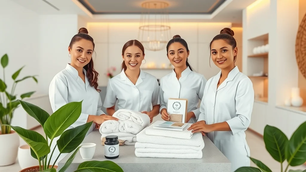
5. Use Real Spa Images, Not Stock (Build Trust Instantly)
How authentic photography supports spa experience and website design
Examples from leading spa websites that showcase real spaces and teams
Guests want to see your actual space—not generic palm stones or faceless models. Using real, well-lit photos of your actual spa reception, treatment rooms, staff, and even the view out your window conveys instant authenticity.
It transforms the guest’s first impression from “generic website” to “I can see myself relaxing there.” If you run a medical spa, showing your team (with credentials) and real treatment spaces builds confidence in safety and professionalism.
Research shows that spa sites with real images see up to 40% more bookings than those relying on stock images.
Investing in one afternoon with a local photographer can elevate your entire brand online. Even staff photos taken with good smartphone cameras, provided they are clear and natural, give potential clients a genuine sense of your hospitality.
In the world of luxury spa website design, authenticity always outshines staged perfection. Trust grows with every well-chosen image.

6. Highlight Spa Services Clearly—No Guessing Games
Accessible lists for spa services on every spa website
Simple site design for clear package/service navigation
Have you ever lost patience trying to find what services a business actually offers? Your spa website UX/UI must present your full suite of spa services—massage, facials, body treatments, and more—in plainly labeled, organized lists
Leading luxury spa websites use landing pages for each main service, making it simple to learn more or book directly from the service detail page.
Whether for wellness seekers or medical spa clients, making your service list clear and inviting turns curiosity into real appointments—without extra calls or emails. Testing this with real customers will prove how clarity boosts bookings.
7. Tell a Spa Story Visually: Use Relaxation-Focused UX/UI
Espa life: using gentle transitions and calming colors in your spa website design
Scenario: From cluttered modern web to serene, inviting layout
Think of the mood you set onsite at your spa: soft music, fluid transitions from room to room, and a color scheme that soothes. Your spa website should mirror this “espa life” visually, with gentle page transitions, muted backgrounds, and a consistent, calming palette (think soft blues, warm taupes, gentle greens).
Too many spa sites are cluttered with flashing banners, competing button colors, or harsh pop-ups. The best user experience is seamless, guiding guests like a gentle host through relaxation, not stress.
Try closing your eyes, visiting your site, and asking: “Does this bring calm, or chaos?”
Video #1: Walkthrough—How Small UX/UI Tweaks Improve Spa Websites
8. Keep Menus Simple: Logical Spa Website Navigation Tips
Minimize confusion with clear labels (main keyword: spa website UX/UI)
Real-world examples where better site design increased guest engagement
Long menus with too many choices leave guests overwhelmed; short, clear navigation lets them find what they need—fast. For best spa website UX/UI, limit main menu options to 5–7 (e.g., Home, Services, Packages, About Us, Book Now, Contact).
Each should use everyday language—think “Book a Massage,” not “Initiate User Booking Flow.” Avoid hiding key information in submenus. When one medical spa changed ‘Our Services’ to individual links (like ‘Botox,’ ‘Body Contouring’), their online consultation requests tripled.
Your site design should make the guest journey as obvious as possible. For luxury spa sites, try mapping out the five most common guest tasks, then adjust your main navigation to shorten those journeys. When menus are clear, engagement and time-on-site both rise—proven in every spa web conversion study.
9. Feature Guest Testimonials Prominently On Your Spa Web Home
Social proof in spa website UX/UI: Where to place reviews for trust
Before/after: Medical spa site with/without testimonials
Nothing builds trust faster than the words of other happy guests. Prominently place client testimonials near your homepage headline, in booking flows, and on every main service page—don’t hide them on a second “Testimonials” tab.
Positive reviews—especially with full names, photos, or video clips—are powerful social proof. For medical spa sites, including client testimonials mentioning safety, results, and staff expertise is essential.
Consider a recent overhaul of a luxury spa website: once they displayed real guest stories up front, their bounce rate plummeted.
In today’s skeptical world, seeing genuine feedback is often the final nudge a potential client needs to trust your spa experience. Whenever possible, add a headshot or short staff reply beneath each review, making the human connection feel authentic.

10. Avoid Tech Jargon—Use Plain, Spa-Friendly Language Everywhere
Copywriting example: Turning ‘user experience’ into ‘guest flow’
Why removing 'marketing-speak' improves user feel (user experience, spa site)
Have you ever read something like “Intuitive UX/UI for seamless navigation” and immediately tuned out? You’re not alone
Always read your web copy aloud and ask: Would I say this to a guest at the front desk?
11. Give Guests the Information They Want in One Click
Fast facts: Hours, address, parking, cancellation policy (spa web)
How to use spa website design for essential info above the fold
Your guests are busy. They need to quickly find your hours, address, parking options, contact information, and cancellation policies—no hunting required. Place these essentials up top, ideally “above the fold” (the first screen before scrolling) or in a sidebar.
This improves their user experience and reduces lost bookings from frustrated web searchers. For luxury spa websites and medical spa sites alike, showing contact info and FAQs on every page keeps your spa web feel transparent and guest-centric.
Put yourself in a potential client’s shoes who wants to confirm drop-in hours before booking.
If they can find information in one click, they’ll convert much more often—and they won’t need to interrupt your team with repetitive phone calls. Even adding small map widgets, quick-contact buttons, and at-a-glance treatment hours can set your spa web experience apart.
12. Speed Matters—Optimize Load Times for Every Spa Website
Practical steps to make spa website UX/UI lightning-fast
Correlation: site speed and appointment conversions
Every second your web page takes to load, you lose impatient visitors—often before they even see your space or offers. Optimize image sizes, reduce unnecessary scripts, and choose reliable hosting.
Aim for under 3 seconds per page. For medical spa websites, where trust and security are paramount, laggy site design can cost you valuable clients and bookings. Google reports that slow sites drop conversion rates by 20% for every extra second of load time.
Ask your web team for a speed check, or use free online tools like Google PageSpeed Insights.
Simple tweaks—like compressing hero images, or using fewer website plugins—can mean the difference between an empty and full schedule. Don’t worry about technical details: your goal is to make sure every guest can browse, learn, and book with no frustrating delays.
13. Use Consistent Branding for a Cohesive Spa Experience
Branded colors, logos, and fonts for memorable luxury spa websites
Simple brand style checks for non-technical spa teams
Your spa website is an extension of your in-person brand. Cohesive branding—matching website color scheme, fonts, and logo use—builds instant recognition and signals professionalism.
It’s the digital version of walking into your spa and seeing branded towels and signage, not mismatched flyers in assorted colors. If you tweak anything in your physical spa (like introducing a new logo or palette), update your spa web visuals too.
Even without a designer, you can check each page for match: Does it feel like your spa, or is it generic? Visual consistency in your spa site design helps guests remember and recommend you
14. Add an Intuitive Booking System—Not Just a Contact Form
How booking system UX/UI affects guest follow-through
Best practices from high-converting spa website design
Too many spa sites only offer a basic “Contact Us” page for appointments, leading to missed bookings and extra admin for your team. Instead, add a clear, intuitive online booking system.
Let guests choose their spa treatment, staff member, and time—all in a few clicks. A strong booking system should confirm via email/text and let users reschedule online. Not only does this help fill your calendar, but it also reassures guests their appointment is secure (especially vital for medical spa or busy luxury spa websites).
Look for booking options that tie directly into your website design and don’t require guests to jump between platforms.
After switching from a simple form to an integrated booking system, many spas report a 25–50% increase in immediate bookings. The easier it is for guests to book, the more likely they’ll follow through—helping your spa site work 24/7.
15. Let Your Spa Team Shine: Personal Touches for Your Site
Photos/bios build guest confidence (luxury spa, medical spa)
Stories from staff: human connection in spa websites
Guests often hesitate to book with strangers. Give your spa web a personal feel by showcasing real team photos, short bios, and even “Meet Our Therapists” stories.
Seeing warm, smiling faces (not stock models) gives potential clients reassurance and starts real trust. For a medical spa, listing credentials adds professionalism; for luxury spas, staff stories showcase what makes your team unique.
One spa that added staff profiles saw a jump in repeat bookings—guests chose therapists who matched their style.
This also celebrates your team, boosting morale and word-of-mouth referrals. Spa website design is ultimately about human connection. When your site feels less like a brochure and more like a warm welcome, guests book more—and come back more often.

16. Layer On Calm: Sound, Movement, and Spa Web Micro-Interactions
Gentle animations, movement, background sound for spa website UX/UI (use judiciously)
Scenario: From static site design to experiential spa web
The goal? Reinforce the calming, sensory feel of your real spa—without overwhelming guests
When a luxury spa website updated their site to use these micro-interactions, guests described it as “peaceful, not showy.” If you’re unsure, test new features with both longtime and new guests—and always offer a mute or pause option for any sound. The most effective spa website UX/UI works just like your best staff: guiding, not pushing.
17. Keep Language Warm, Inclusive, and Guest-Centered
User experience tip: mirror real spa conversations
Copywriting for clarity vs. confusion in spa website design
When your copy mirrors real conversations (“What can we help you relax today?”), your spa website UX/UI instantly feels more approachable and caring
Real guest feedback often mentions how calming or welcoming a website feels—far more than the number of treatments offered.
For spa owners and directors, reviewing all website content through the lens of hospitality, not just marketing, is the easiest way to set a tone that drives both trust and bookings.
18. Allow Appointment Booking from Multiple Pages, Not Just One
Booking accessibility: tidbits from leading luxury spa website audits
Where UX/UI shortcut buttons make the biggest difference
If a potential client reads about a new spa treatment or finds a special offer, don’t make them hunt for the booking button. Place “Book Now” links at the top, bottom, and within service description pages.
Wellness leaders report higher conversions when guests can move from information to reservation instantly—from the home page, service details, or even your team bio pages.
This spa website UX/UI shortcut is a true win-win: it removes obstacles for guests, and fills your calendar with less friction.
On many luxury spa and medical spa sites, adding contextual booking buttons (“Reserve Your Massage,” “Book with Jenna”) increases both single service and bundled package bookings. It also helps you track which services are most popular online—and where to focus marketing efforts.
19-29. Quick Spark Tips for Instant Spa Website UX/UI Wins
19-Use soft, calming ‘book now’ buttons
20-Show trust badges (like BBB or wellness affiliations)
21-Add live chat or callback offers
22-Use white space for a clean look
23-Group related spa services together
24-Offer easy gift card purchase
25-Use soft imagery instead of sharp edges
26-Add an FAQ section linked from key pages
27-Feature spa site location map
28-Let guests preview your space through virtual tours
29-Include a blog or news section for updated stories
30. Measure, Test, and Evolve: How to Keep Your Spa Website UX/UI Fresh
Real-world KPIs (Key Performance Indicators) relevant to spa owners
Simple tools to track guest behavior and booking conversion
Schedule quarterly check-ins to ask front desk staff and clients, “Was the site easy to use? Was anything confusing?”
Medical spa and luxury spa owners who measure these numbers consistently—then update their spa web based on findings—see better retention, more bookings, and a reputation for caring about guest satisfaction. Remember, your digital hospitality journey is ongoing.

31. Tie It All Together: Spa Website UX/UI as a Cornerstone of Business Growth
Why UX/UI is not a one-off project but an ongoing part of spa site and guest experience
How this topic strengthens the whole high-converting spa website strategy
Much like keeping your spa space spotless and welcoming, high-performing spa website UX/UI is a continual process.
It’s not a one-off fix, but an ongoing investment in guest happiness and business growth. Every digital decision—from buttons to photos to copy—either leads guests closer to booking, or sends them away.
The most successful spas treat their spa website UX/UI as a living extension of their guest care philosophy, adapting as customer needs and digital habits change.
Reference Table: 31 Spa Website UX/UI Tips Checklist for Non-Designers |
||
# |
Action Step |
Status |
|---|---|---|
1 |
Match web visuals to real spa space |
[ ] |
2 |
Streamline booking into 1-2 clicks |
[ ] |
3 |
Test all pages on mobile devices |
[ ] |
4 |
Use accessible fonts and high contrast |
[ ] |
5 |
Feature real team photos |
[ ] |
6 |
Organize services with clear, clickable lists |
[ ] |
7 |
Apply calming colors and soft transitions |
[ ] |
8 |
Keep main menu simple and guest-focused |
[ ] |
9 |
Add testimonials to crucial pages |
[ ] |
10 |
Avoid industry jargon, use ‘spa voice’ |
[ ] |
11 |
Show hours and location above the fold |
[ ] |
12 |
Optimize images/site for fast loading |
[ ] |
13 |
Check page colors/fonts for branding consistency |
[ ] |
14 |
Implement a true online booking system |
[ ] |
15 |
Highlight team with pictures and stories |
[ ] |
16 |
Add gentle site animations or sounds |
[ ] |
17 |
Review language for warmth and inclusion |
[ ] |
18 |
Place book buttons on every major page |
[ ] |
19-29 |
See Quick Spark Tips (above) for instant wins |
[ ] |
30 |
Schedule site review and analytics check quarterly |
[ ] |
31 |
Commit to ongoing UX/UI upgrade mindset |
[ ] |
“Choosing the right spa website UX/UI is an act of hospitality—online and off.”
People Also Ask: Spa Website UX/UI Questions Answered
What is spa website UX/UI and why does it matter for bookings?
Spa website UX/UI means how your website looks, feels, and works—from layout and colors to booking flow and navigation. For bookings, it's the “digital journey” that makes guests comfortable, just like a welcoming reception area does in person.
If your booking system is smooth and the information is easy to find, users feel safe to reserve. Poorly designed spa web pages leave guests confused or anxious, so they don’t book at all.

How can a small spa improve its website UX/UI on a budget?
Start with what matters: use real spa photos, declutter menus, and add a clearly labeled booking button on every main page. Write site content in plain language and group your spa services logically.
Use a website builder with clean, calming templates. Ask guests for feedback—many will gladly point out confusing parts. These quick fixes require little to no tech knowledge, but can drastically lift bookings and impression.
What are common UX/UI mistakes in spa web design?
Frequent issues include: using stock images instead of real spa photos, hiding essential info like hours or location, cluttered or too-complex menus, slow-loading pages, tiny booking buttons, and technical jargon in copy.
On luxury spa website or medical spa sites, mismatched branding or ambiguous service lists also hurt credibility and guest trust.
How does spa website UX/UI affect first impressions and guest trust?
Just like a guest sizing up your lobby, your website’s feel, speed, and layout create an instant impression—good or bad. Data shows guests decide to trust (or not trust) your spa web in under 7 seconds.
If your site is clean, authentic, and easy to navigate, trust grows and guests relax—making them much more likely to become loyal clients.
FAQs: Spa Website UX/UI Practical Advice
What’s the difference between spa website UX and UI?
UX (“user experience”) is like your overall spa experience—it’s how guests feel moving through your site, just as they would in-person. UI (“user interface”) is the visuals—colors, buttons, fonts—just like your decor and branding. Both work together for the best results.How often should I update my spa website design?
Review every 1–2 years, or anytime you change branding, add services, or get guest feedback about issues. Frequent small updates (like new images or testimonials) keep your spa web feeling fresh.Is it worth hiring a specialist for our spa site UX/UI?
For many spas, yes—especially if you lack time, or bookings aren’t where you want them. A spa/UX consultant can quickly spot gaps that may be costing you clients. Just be clear on your goals: more bookings, easier navigation, or better branding.
Key Takeaways: Spa Website UX/UI Essentials Recap
Website clarity and guest comfort directly drive conversions and bookings
Most improvements—better photos, cleaner navigation, real testimonials, and mobile-ready design—are within reach, even with limited time or technical know-how
The best spa website UX/UI makes guest experience feel as smooth online as in person
Ready to Elevate Your Spa Website UX/UI? Reach Out with Confidence
If you’d like help applying this to your own spa website—or you just want clarity before making changes—you’re welcome to reach out. There’s no pressure. Just a conversation to help you move forward with confidence.
Conclusion: Thoughtful, guest-focused spa website UX/UI puts your business ahead—one simple, practical improvement at a time.


Write A Comment